



Most agency dashboards are built for clients, not for the people running the agency. You end up with hundreds of campaign-level charts and zero visibility into whether the business itself is healthy. Owners find out they overhired three months too late, or that a "profitable" retainer has been quietly underwater for a quarter because a senior strategist keeps rescuing it in the background.
The fix isn't more data. It's a small, deliberately constrained set of leadership metrics — an agency operational scorecard — that measures the health of the operation, not the campaigns. Done right, this scorecard predicts three things earlier than anything else: when you can safely scale, when a client or tier is bleeding margin, and when you actually need to hire.
This piece walks through the metrics that matter, how to define them so they can't be gamed, the cadence to review them, and the playbooks to run when a number turns red. The goal is a scorecard tight enough that you can read it in five minutes and trust it.
Why most agency scorecards quietly fail
The failure isn't usually a bad metric. It's three structural problems that show up again and again.
Too many metrics. A scorecard with 30 numbers is not a scorecard — it's a spreadsheet nobody reads. Leadership attention is the scarce resource. If everything is important, nothing gets acted on.
Metrics with no measurement rule. "Utilization" sounds precise until you ask three people how they calculate it and get three different answers. One counts billable hours over 40, another over scheduled hours, a third includes PTO. Without a locked definition, the number drifts and month-to-month comparisons become meaningless.
Lagging metrics that only confirm damage. Revenue and net margin are outcomes. By the time they move, the cause happened 60–90 days earlier. A useful scorecard mixes a few outcome metrics with leading indicators that move first — capacity load, delivery variance, pipeline coverage.
There's a fourth, subtler issue: scorecards built entirely from client-facing reporting tools. If your numbers live in the same place you build client dashboards, you inherit all the noise of campaign performance. The operational scorecard needs its own home and its own logic. We've written before about why agencies should end reactive dashboards and build reporting on real KPI governance — the operational scorecard is the internal cousin of that idea.
The core scorecard: 8–10 metrics that actually predict things
Below is the compact set. Each one earns its place because it either predicts a decision (hire, fire a client, reprice a tier) or catches damage before the P&L does.
Eliminate marketing chaos with streamlined campaign control.
Digmaly lets you plan, execute, and track every campaign effortlessly.
- Unified campaign management
- Real-time client reporting
- Collaborative team workflows
No credit card required
| Metric | What it measures | Measurement rule | Red threshold (typical) |
|---|---|---|---|
| Delivery margin per account | Profit after fully-loaded delivery cost | (Retainer revenue − loaded hours cost) / revenue, monthly | Below ~35% |
| Billable utilization | How loaded delivery staff are | Billable hours / available hours (excl. PTO, internal) | Above ~85% or below ~60% |
| Effective hourly rate (EHR) | Real rate earned per delivery hour | Account revenue / total hours worked on it | Below the tier's floor rate |
| Client concentration | Revenue dependence risk | Largest client % of total MRR | Any client above ~20% |
| Net revenue retention | Growth/shrink inside existing base | (Start MRR + expansion − contraction − churn) / start MRR | Below 100% |
| Pipeline coverage | Future revenue safety | Qualified pipeline value / next-quarter target | Below ~2.5x |
| Delivery variance | Scope vs. planned effort | Actual hours / scoped hours per account | Above ~1.25 |
| On-time delivery rate | Operational reliability | Deliverables shipped on committed date / total | Below ~85% |
| Senior-dependency ratio | Key-person fragility | % of accounts requiring a specific senior person | Above ~40% |
| Cash runway (optional) | Buffer against shocks | Cash / avg monthly burn | Below ~3 months |
Ten is the ceiling. If you're a lean shop, drop cash runway and senior-dependency and run eight. The point is discipline — every metric here answers a question a founder actually asks out loud.
Why these three do the heaviest lifting
If you could only keep three, keep delivery margin per account, billable utilization, and delivery variance. Together they tell you whether your work is profitable, whether your team can take more, and whether your scoping is honest. Almost every "we grew revenue but made no money" story traces back to one of these being ignored.
A pattern worth naming: agencies obsess over utilization and ignore variance. High utilization with high variance is a trap — your team is fully booked because every account is eating 25% more hours than sold. You feel busy and profitable right up until margin collapses.
Measurement rules: the part everyone skips
A metric without a locked definition is a future argument. Before the scorecard goes live, write the rules down somewhere version-controlled. A few that cause the most disagreement:
-
Loaded cost, not salary. Delivery margin has to use fully-loaded cost — salary, benefits, software seats, and a share of overhead. Using raw salary makes every account look 20–30% healthier than it actually is.
-
Available hours excludes the noise. Utilization denominators should strip PTO, holidays, onboarding time, and internal projects. Otherwise a person on a two-week vacation looks catastrophically underutilized and the number lies.
-
Hours have to be captured consistently. This is the weakest link in most agencies. If half the team logs time daily and half reconstructs it Friday afternoon from memory, delivery variance and EHR are fiction. Consistent time capture is a prerequisite, not a nice-to-have.
-
Pipeline "qualified" needs a definition. A deal only counts toward coverage if it meets fixed criteria — budget confirmed, decision-maker identified, scope discussed. Otherwise coverage inflates and you skip a hire you actually needed.
Make time capture mandatory daily and audit a sample weekly — inconsistent logging breaks every metric.
The rule of thumb: if two competent people can't compute the metric the same way from the same raw data, the definition isn't done.
Where AI-assisted operational tooling quietly helps
The scorecard's biggest enemy is manual assembly. When numbers get pulled by hand from timesheets, the accounting system, and the CRM once a month, they arrive late, inconsistent, and stale — which is exactly when leading indicators stop leading.
This is where an AI-powered operational platform earns its keep, not as a dashboard for its own sake, but as the thing that keeps the scorecard honest and current. In practice that looks like: automatically reconciling logged hours against scoped hours to flag variance before it compounds, watching delivery-margin trends per account and surfacing the ones drifting toward red, and flagging when someone's utilization crosses a threshold two weeks running. The value is timing — you get the red signal while you can still act on it, not in a month-end review when the damage is already done.
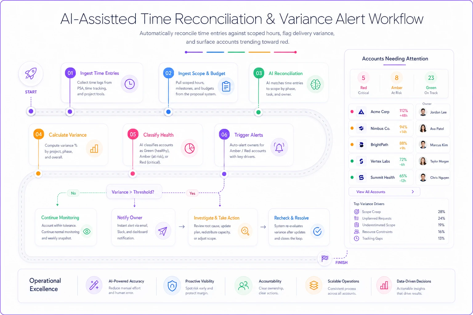
The graphic shows how automation keeps the gauges current and surfaces actionable reds early.
The deeper point: capacity, hiring, and profitability triggers only work when the underlying numbers are trustworthy and timely. We've gone deep on that logic in why capacity formulas, hiring scorecards and profitability triggers should drive your agency operational playbook. The scorecard is the instrument panel; automation is what keeps the gauges from lagging reality.
Review cadence: how often each metric earns attention
Not every metric deserves a weekly look. Reviewing margin daily creates anxiety and false alarms; reviewing utilization monthly means you catch overload a month too late. Match the cadence to how fast the metric moves.
Weekly (15-minute ops standup):
-
Billable utilization by person
-
Delivery variance on active accounts
-
On-time delivery rate
-
Any account that flipped to red since last week
Monthly (leadership review, ~60 min):
-
Delivery margin per account
-
Effective hourly rate by tier
-
Net revenue retention
-
Pipeline coverage
Quarterly (strategic):
-
Client concentration
-
Senior-dependency ratio
-
Tier-level profitability (are your service tiers still structured right)
-
Cash runway trend
A cadence that actually holds: weekly numbers stay operational and blameless — the standup exists to surface reds and assign an owner, not to litigate. Monthly is where money decisions happen. Quarterly is where structural decisions — repricing a tier, restructuring the team, cutting a concentration risk — get made.
Playbooks: what to do when a number turns red
A scorecard without playbooks just creates informed anxiety. Each red signal should map to a defined first move. Here are the three that matter most.
Red signal 1: Delivery margin drops below ~35% on an account
-
Pull the last 60–90 days of hours by role. Find where the time actually goes.
-
Separate scope creep from inefficiency. Creep means the client is getting work they aren't paying for; inefficiency means your process is slow.
-
If creep
document it and open a scope conversation with real numbers, not gut feeling.
-
If inefficiency
assign an owner to fix the process, set a 30-day recheck.
-
If the account was mispriced from the start, route it to the next repricing cycle rather than a mid-contract fix.
Red signal 2: Utilization above ~85% for two-plus weeks running
-
Confirm it's real and sustained, not one crunch week (this is where the variance metric matters — high utilization plus high variance means the overload is structural).
-
Check pipeline coverage. If coverage is above ~2.5x, the load is durable and hiring is justified.
-
Bridge the gap short-term with contractors before committing to a full-time hire.
-
If two consecutive months show 85%+ with healthy coverage, that's the hiring trigger — pull it before the third month.
Hiring off gut feeling either comes too early (margin drops) or too late (burnout and churn). The utilization-plus-coverage combination is what makes the trigger objective.
Red signal 3: A tier's effective hourly rate falls below its floor
When a whole service tier — not one account — shows EHR below its floor, the tier itself is broken, not the client. That's a pricing and packaging problem. Freeze new sales into that tier, model what price or scope would restore the floor, and roll changes in at renewal.
A real scenario: the "growing but broke" agency
A mid-sized paid-media shop, roughly 14 people, around $210k MRR. Revenue had grown about 30% over the year and the founders were baffled that the bank balance hadn't moved with it. No operational scorecard — just client dashboards and a monthly accountant summary.
Building the compact scorecard surfaced three things in the first month. Their two largest clients made up close to 45% of MRR combined — one loud complaint away from a very bad quarter. Their mid-tier "growth" package was running delivery margin around 22%, dragged down by two accounts eating roughly 1.4x their scoped hours. And utilization on the senior strategists sat near 90% while two junior hires sat around 55% — work wasn't being delegated because scoping and handoffs were sloppy.
None of that was visible in revenue. Over the next quarter they repriced the growth tier at renewal, rebalanced work toward the underused juniors, and had a scope conversation on the two bleeding accounts. Delivery margin on that tier climbed into the mid-30s, senior utilization eased into a healthier low-80s, and — this was the part the founders cared about — cash finally started tracking with revenue. No heroics. They just started measuring the operation instead of the campaigns.
When a lean scorecard makes sense (and when it doesn't)
When it makes sense: you're past the founder-does-everything stage, running roughly 8+ people, and decisions about hiring or dropping clients are starting to feel like guesses. That's exactly the zone where a compact scorecard pays for itself.
When it's overkill: a three-person shop with two clients doesn't need net revenue retention and senior-dependency ratios. Track margin per account and cash. That's it. Adding metrics before you have the scale to act on them just creates ritual without decisions.
Who should not do this: anyone who'll build the scorecard and then not hold a cadence around it. A scorecard nobody reviews on a schedule is worse than none — it creates false confidence that the business is being watched. The review rhythm is the product; the dashboard is just the surface.
Getting started without boiling the ocean
You don't need all ten metrics on day one. A sane rollout:
-
Lock time capture first. Nothing else is trustworthy without it.
-
Stand up four metrics — delivery margin per account, utilization, delivery variance, pipeline coverage.
-
Write the measurement rules down and get two people to agree on them.
-
Run the weekly standup and monthly review for one full month before adding anything.
-
Layer in retention, concentration, and dependency once the core four are stable.
The whole thing should feel almost boring once it's running. That's the sign it's working — the surprises move out of your P&L and into a Tuesday standup, where they're small, early, and fixable. An operational scorecard doesn't make the hard decisions for you. It just makes sure you're making them on time.
The whole thing should feel almost boring once it's running. That's the sign it's working — the surprises move out of your P&L and into a Tuesday standup, where they're small, early, and fixable. An operational scorecard doesn't make the hard decisions for you. It just makes sure you're making them on time.
Ready to elevate your agency's performance?
Join 2,000+ agencies using Digmaly to save time, boost efficiency, and deliver superior client results.